
Cookbook
App Redesign
For this project, I undertook a complete redesign of the Cookbook app. My process began with thorough research, including analyzing product reviews, conducting competitive analysis, and interviewing users. From this research, I discovered that while users appreciated the app’s content, they desired a more robust design and additional features to enhance their experience.
To address these needs, I restructured the app’s information architecture (IA) to prioritize simplicity and usability. The new navigation includes four primary sections: an explore page, a search page, a shopping list, and a profile page.
A standout feature of my redesign is personalization. Before entering the app for the first time, users take a quiz to input their preferences, dislikes, allergies, and dietary needs. This ensures the explore page is tailored to recipes and content they’re most likely to enjoy. Additionally, I introduced a profile function that connects to a central database, enabling cross-platform personalization for a seamless user experience across devices.
This redesign focuses on creating a more intuitive and engaging experience, transforming the Cookbook app into a tool that feels as personal and helpful as a favorite recipe book.


Prototype
Information Architecture
When I began creating the information architecture (IA) for the Cookbook app redesign, I was inspired by “The Comprehensive Guide to Information Architecture” by James Pikover. This article introduced me to Draw.io, a tool that helped me bring my initial sketches to life. The guide included a YouTube tutorial on building IA using Draw.io, which proved invaluable during the early stages of the project.
App Structure and Pages
For the redesign, I streamlined the application into four main pages: Explore, Search, Shopping List, and Profile.
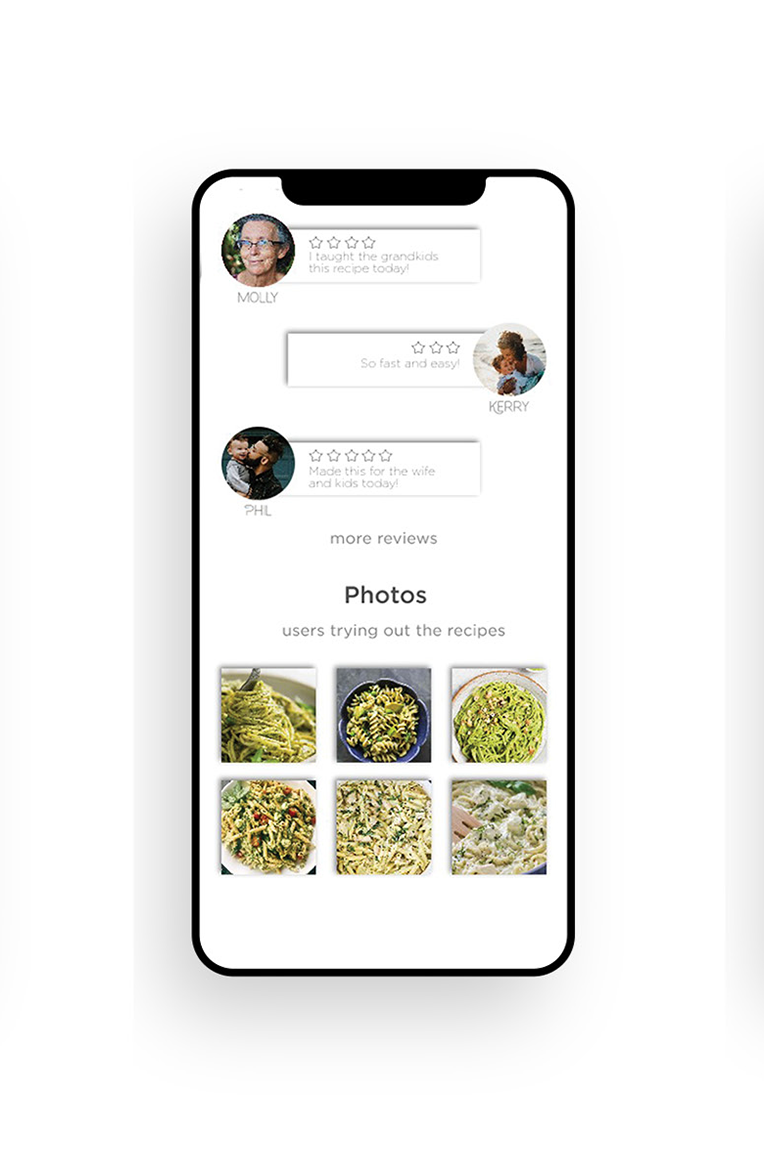
Explore Page: Recommends new recipes tailored to the user’s preferences based on their saved recipes.
Search Page: Allows users to find recipes by ingredient or dish name, offering a straightforward way to discover new ideas.
Shopping List Page: Helps users organize ingredients for recipes, automatically sorting them by grocery store sections for a seamless shopping experience.
Profile Page: Empowers users to save recipes in customizable categories, making organization intuitive and personal.

Key Features
Simplicity: The app features a clean, intuitive design with a consistent navigation bar at the bottom of every page.
Personalization: Users are prompted to complete a quiz during setup to tailor the experience to their preferences. Saved profiles sync to a central database, ensuring seamless personalization across devices.
Advanced Functionality
Apple Watch Integration: The app detects if the user frequently uses the Apple Watch app (e.g., opening it three or more times). Upon recognition, the app notifies users of the Apple Watch version, providing convenient access to the shopping list.
Error Handling: I designed error-specific screens, such as no results for a search query, a lack of internet connection, or other app issues, ensuring a smoother user experience even in less-than-ideal scenarios.
Settings Page: This essential feature offers options to adjust font size for better accessibility, change languages, and manage other customizations to meet diverse user needs.
Wireframes and User Focus
When designing wireframes, my primary goal was to create a user-friendly and accessible app. I accounted for various user scenarios—both good and bad—to ensure a seamless experience. By prioritizing usability and incorporating thoughtful features, the redesigned Cookbook app is intuitive, functional, and tailored to its users.
New Design
After creating wireframes, the next step was to build prototypes to bring the app to life. My challenge was to design three completely different visual styles for the Cookbook app, each evoking a unique tone and experience:
Design Concepts
Modern & Clean
Style: Inspired by contemporary cookbooks, this design featured a modern sans-serif font with a playful edge to reflect the fun side of cooking.
Visuals: Large, airy photos with white overlays created a clean and minimalist kitchen aesthetic.
Feeling: Perfect for users seeking innovative, cutting-edge recipes presented in a sleek and polished way.
Earthy & Natural
Style: A design rooted in nature, using earth-toned colors and an organic, hand-drawn font.
Visuals: Subtle textures and muted tones conveyed a sense of warmth and sustainability.
Feeling: Evoked the idea of healthy, organic, and wholesome recipes, appealing to users who value natural ingredients.
Bright & Bold
Style: A playful approach with vibrant, highly pigmented colors and bold color-blocking elements.
Visuals: Eye-catching designs with strong contrasts and dynamic layouts.
Feeling: Felt youthful, fresh, and exciting, perfect for users who enjoy creative and trendy recipes.
Each design offered a distinct experience, reflecting different types of recipes and culinary adventures. After evaluating the prototypes, a final design direction was selected based on user feedback and project goals.
Building the Final App Screens
With the design direction chosen, I moved on to building the screens for the entire app. This process, however, revealed several challenges:
Time Management
Designing every screen for the app proved far more time-intensive than anticipated. Creating individual components, maintaining consistency, and ensuring functionality required careful attention to detail and significant effort.
Missed Wireframe Details
During the wireframing phase, I overlooked a few crucial details, which created additional work during prototyping. For example:
On the Explore Page, while I designed a detailed recipe screen for single dishes, I hadn’t accounted for variations of this screen for multiple categories like trending dishes, cuisines, or meal types (breakfast, lunch, dinner, and snacks).
This oversight required me to create multiple new screens, adjust navigation, and re-evaluate user flows to ensure a seamless experience.
Lessons Learned
This stage taught me the importance of planning for scalability during the wireframing process. Accounting for variations and edge cases early on would have saved time and streamlined the design process. Despite these challenges, building the prototypes and final screens was a rewarding experience that pushed my design skills and attention to detail to the next level.
